Experimental Printmaking
I am quite struggling to order this on my blog because everything is so fluid and one thing builds on another but I feel like this deserves its own post because it would break up the flow...
I feel like this project is naturally developing and evolving itself as everything links to another and its so exciting when a spark happens that I want to explode! I am enjoying this so much.
I was sitting in my room and noticed string. A very functional and long flowing household item! I was having a rubbish day and creating this was the most soothing thing ever and by the end of gluing the string down I was on a roll...
This is a continuous (string) line drawing visualising the flow of the tape on its machine.
ALSO in the Dr.Who theme tune
'The main, pulsing bassline rhythm was created from a recording of a single plucked string, played over and over again'. Here this is a single stuck down string, printed over and over again!
I started off by doing a graphite rubbing over the string. This wasn't a very defined way of picking up the lines however I feel that motion is captured and because it is black and white it does achieve a retero aesthetic...
Then to printing...
I thought it was important to capture the actual printing plate as I really love how the ink has left roller marks (with a very gestural and thin quality) which creates the illusion of movement and flow. She also made everything very analogue and I love the texture of the string standing out with ink on it.
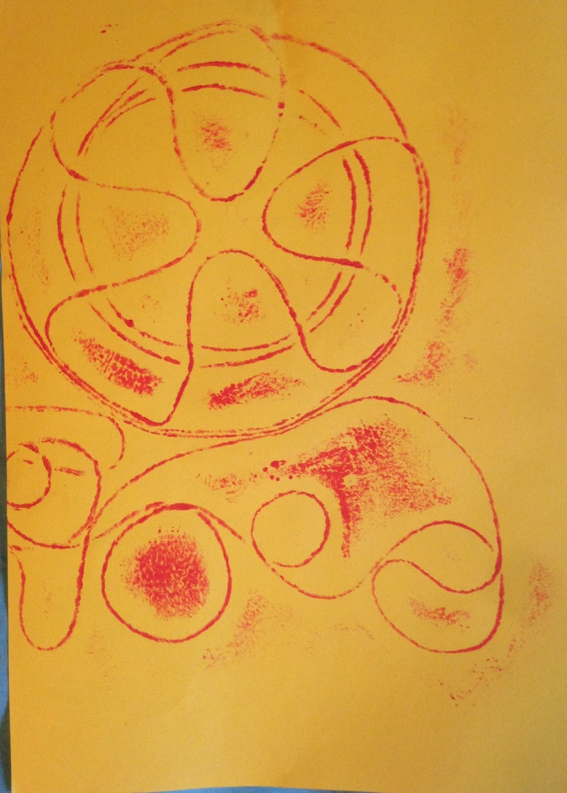
After printing on a white piece of paper I thought I would move to coloured paper. This project has somehow incorporated coloured paper in almost everything... I only had a4 sheets of this paper and I kind of like how the colours clash almost because they are such a stereotypical tone. HOWEVER this meant I needed to crop the image.... She works with segments of tape so here I had to chose segments of my image. This makes the image look more abstract. I started off using it centrally but think it looks quite cool off centre as well.
I thought I would try one portrait to see how it would turn out. This is directly in half and I dont feel that this works as well compositionally as the horizontal ones HOWEVER whilst writing this blog it is simple enough to be able to draw over so in the sketchbook it goes...
I then waited a short while for the red ink to dry before moving to blue.. This is equally as interesting and I wanted to capture this before it dissapeared forever. I have found that I am equally as interested in the process of making as the final result (the is an example but also with the way I work holistically)
I also printed blue onto a piece of tracing paper and then physically layered up the image. These colours create an almost 3D lense aesthetic.
I then moved onto a different type of paper... I thought I would try and capture the backstory behind the tape. That it has been carefully crafted through different notes all spliced up with a lot of accuracy and care... Therefore the perfect backgrounds would be sheet music (which visualises precisely the length and pitch of the different notes-although the only sheet music I had was for a breakdown from my bluegrass band so this isnt 100% representative). The other was the grid off my cutting mat which I scanned.
Then I thought I would move onto a 3rd colour...
Look at the texture on this! This in itself works on the fact that when she cut up the different tapes she made some sounds more prominent and others more obscure... This is shown here by the red being obscured and the green being the most prominent but there being areas that blue is shown through as well. LAYERS, SOUND
It is noticeable that by this stage a lot of ink had built up as there are bold patches around the string but I really like this as it adds depth to the images and shows even more motion
I then tried again with the green layered on tracing paper on top of the blue paper print. This has come across quite blurry...
I then printed the green directly on top of the red print. I like that it is slightly dis-alligned.


No comments:
Post a Comment