Screen Printed Fan Poster
I wanted to do the doors as something which I am a fan of. I am a massive fan of the doors and have drawn Jim Morrison before. I wanted to create a poster which wasn't just replicating a drawing I have done before or many of the doors posters which already exist. I was in the bath listening to the doors and it dawned on me that all of the doors songs are very metaphorical and pectoral and would translate into imagery. I then made a list of different lyrics from their popular songs:
1) Show me the way to the next Whiskey Bar
2) Queen of the highway (save the blind tiger, black dressed in leather), she was a princess
3) Peace Frog
4) Waiting for the sun
5) Im a spy in the house of love
6) Faces come out of the rain, when you're strange
7) Take me Spanish Caravan
I decided that I wanted to make a poster which collaborated 6 different scenes. This is enough that they can be large and detailed but not that large so that its so busy.
I think compositionally they aren't in the right order at the moment, I need to switch the frog into the centre as it is an image in the centre of the page rather than a scene as much. Also there are two figures that are in the 2nd half of their frame and it look wrong having 2 images with the figure in the same place. I do however like that the figures and caravan are looking in, but closer to the outside of the page.

I also added the doors logo on the caravan- subtle but still there.
It was quite difficult figuring out the colours as to what works next to each other. I am going to use the blue as the outline and one layer and then the yellow only as fill. I did feel that I could use blue to add colour fill as well but came across problems. Here I have a black fine liner as the outline and realised that there will be no evident outline when it comes to blue/blue parts of the images. Therefore my solution to this is to try and leave a white mark in-between. This may look a bit strange Im not sure but I think that it will look better than an undefined blue merging blob.
With the whiskey bar I like the alternate blue and yellow tiles but also think it will look quite cool with the bottles having the other colour than its tile background, makes it more interesting. Also in that scene there is almost the rule of thirds because there is enough room for 6 chairs but Morrison is taking place of the left third and his figure being taller and reaching half of the image makes it seem less sparce.
In the queen scene the queen in facing away as if to walk across the road. The horizon is not in the centre and it does wiggle slightly which makes it a more interesting compositional image even though it is quite simple.
The beach scene has the figure sitting in the centre but the sun is offset.

I need to scan this in because I drew it a3 and the will redraw it a4 on the 2 sheets of paper.
I need to arrange the different images until I am happy
Then I need to print it off
Then I need to draw the yellow and the blue as separate a4 layers on a landscape piece of a3.

This is my photoshopped version after scanning it away! I shrunk it down to a4 size so that I could light box over the top of it. I have arranged it so that the ones with out a background are alternate left and right and vice versa.


Also I am sharing my board with my friend so I had to do the positives size a4 on an a3 sheet. She has done hers via Wacom and is going to print it out on the other side of the page so I have my fingers severely crossed in the hope that she manages to print it on the right hand side!

Before screen printing I was advised to go over everything in glass pencil because apparently the pencil won't pick up because it has to be solid black.
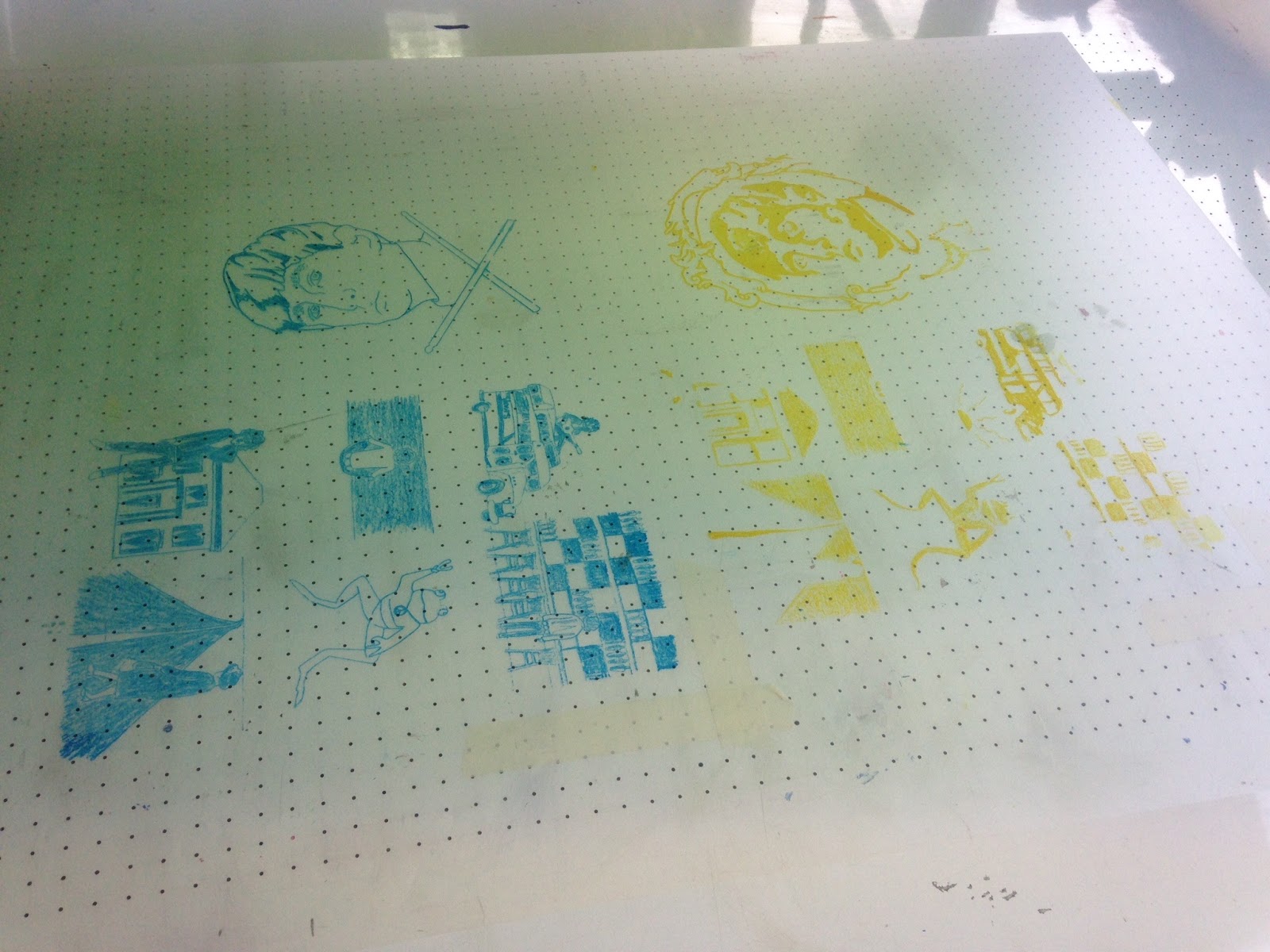


Also some of the prints that were double inked came across very pale, the stronger ones are definitely more effective.

The scan has made it a more turquoise blue...
I am quite happy with how it has turned out! I also am very happy with my representations of the songs and think they are very clever but no-one else seems to get them...guess you have to love the doors!
No comments:
Post a Comment