Monday, 27 February 2017

Ricardo Gavinhos

Ricardo Gavinhos - Vector artist


I have never really come across vector/shape artists before. Therefore I found this brief quite difficult to visualise because I still have a very basic understanding of digital art so when I was designing my stickers it was difficult imagining the flat colour and how it would work.
I looked through a search engine to try and find some vector artists and some of the images were things I wasn't interested in at all, not the kind of art I liked. However I saw this artist on a search engine and could appreciate how he has built up tone through flat colour.

He has managed to create a very complex image through different shapes acting as different tones (for example in the hair and in the face) and it works really well and i think it is also quite brave. It is also quite technical how he has managed to get the detailed lines in the hair and the nose.
 Everything is built up through shapes rather than line which is what is difficult to get your head around but it is also very striking when it is done well. This has quite a minimalist build use of different colours and the face and hair are mainly one shape. The use of bright colours is interesting.


Illustrator

Illustrator Attempt 1
I scanned in my 2 images that I like the best from my drawings and started playing around with them using Illustrator. I used the drawings I already had and tried cutting the lines to de-tach them from the outside circle. I selected and deleted all of the small dot shapes that had picked up. Used the paintbrush tool to colour things in  and out a coloured shape behind. I felt I was almost getting there with the hand although one finger wouldn't go white so I was trying to rub it out using my mouse as the Wacom didn't want to work with Illustrator (I never managed to finish this because it just looked rubbish and messy). I also managed to delete the awful marker-pen-round-candle circle and create the right sized circle for the sticker. I had managed to miss the illustrator workshops but I had a flatmate who could show me the basics...


Stickers Designs

STICKER DESIGNING
Mind-maps! I always like to start my design process through words and a mind map. The phrases are too long to be used as catch phrases but it was a way of quickly exploring multiple different ideas. I made this by starting some branches and then as ideas popped in my head throughout the day I would come back and add to the mind-map.
As I have been through a rough few weeks I have really noticed the small acts of kindness. In fact this morning I wrote a letter of appreciation to my flat, including thanking people for making me a cup of tea every now and then because it did make a difference. I therefore thought that this would be a perfect image to explore. I tried to design the backgrounds so that they reflected a kitchen for example tiles. I felt that these ideas were very twee and not something I would be happy./proud of as a sticker.
I then moved onto treating yourself off my mind-map. That looking after yourself is an act of kindness. These are all acts of kindness that girls do to make themselves feel good (which I have practiced in these horrible past weeks). I quite like the bath one because the bath is very simple but the bubbles fill up the background as a pattern. I also quite like the feet one and that the writing fits with the image as if it is the nail varnish. I really hate feet though and drawing them made me notice even more how weird they are. However these are all very girly ideas and I don't really want to create a sticker that is so specific and cliche.

I forgot how important inspiration is when designing. I went through my 'Urban Art' book thinking that this links with communicating a simple message visually. I came across this face and just thought YES. I looked at it for a while and then went to make a cup of tea and drew it. This was I thought it would definitely be inspiration rather than copying but I can see that there are some similar features.

I came up with this idea because my friend came round and was really down and I felt like I should make her happier by being doubly happy, therefore radiating happiness and it works and I felt that this is an act of kindness. If you are a very externally happy person it will rub off on others because there are so many positive vibes. I also like this character because it is quite abstract for me and definitely made up with shapes and looking at it just makes me happy because it is sooo funky and weird.
I thought that to make something meaningful I should think broader, into things that really are important to more than one or two people. I looked through some political books and wracked my brains for important parts of A-level History, German and Politics. I am aware from doing work for Leicester University that to put an image out now a days that has men and women holding hands it needs to be representative of LGBT as well as heterosexual people.
I thought this was a nice simple image, using the iconic toilet people and it is definitely built up of shapes. I like the equality image because it symbolises integration and works well as a design. Also the tight grasp of the hands is very impacting. It reminds me of the front cover of noughts and crosses a bit and the use of inverting.
I think I like the share the wealth the most. It is supposed to be the falling of coins into a homeless persons hand or someone begging. I thought I would carry out this act of kindness and I collected at 58p's worth of my bronze coins and have given them out to homeless people in Leeds.

Saturday, 25 February 2017

Lense based Gif

Lense Based Gif
I bought some plasticine in the hope that I could make some models for my characters. I have done clay work before (working at an arts and crafts club in the holidays) and understand that you need to work from blocks of clay rather than making little bits and sticking it on as it doesnt work. Therefore I made plans of the different sections of I was going to model. I bought 3 tones of the same colour so that they would match the drawings of the characters.


I engraved this using an etching tool, pushing the neck back so that it would stand back from the chin. I didnt realise how difficult it was using plastecine until trying to craft this figure! It is not as malleable as clay at all.


Basically she couldnt stand up. The blocks used for her head and skirt and top is waaaaay to heavy compared to the arms and legs. I was considering how I could maybe add something through it like a pole or hand her from her head and hold her with string. I also couldnt figure out how to glue the parts together because PVA glue wasnt enough.

I therefore was panicking slightly as I didnt have very much time but luckily my models were free! So I got them to dress up in their costumes and go outside to the road where I could take lots of photos of them acting. I stood in the same place and filmed it 2ce. There are some absoultely amazing mid run photographs of the guy


I then had to over lay the different photos and put them in the right order . I tried lining them up by the curb and the girls shoes. I also made the first image low opactity so I could line up the images better.
I has 11 different layers/images.
I then had difficulty saving the Gif. It wasnt even so much the saving it was that something happened to the image quality. It either saved very pixlated with different colours of grayed the colours. What was bizarre was that when I saved the Gif and put it into the 4 different options they looked normal and how it came up on my screen but as soon as they actually saved it went wierd. 
I decided to submit the Gif that had over exaggerated colours because I felt that it made the people look more like characters.


Tuesday, 21 February 2017

Gif research

Gif research

http://giphy.com/gifs/dancing-friday-3oEdv31lb6MQv2XNfO


Love this dude! I like the choice of block colour in his trousers and hair in contrast to the line as an outline. I also like that there is a texture used within the block colour.

http://giphy.com/gifs/animation-illustration-gif-3oEduIHiGbvjWnsWv6
The choice of colours in this really reflects a girly girl and works as a way of character design. I also really like the importance of the hair and how it flows around her shoulders. Also the lack of marks on her skirt but that the few lines there do make a difference.

http://giphy.com/gifs/illustration-7CwM0vPeqBhUQ

This Gif reminds me of my male characters crazy dancing. I really like the curved arm coming around and how it is such an outgoing motion. This definitely promotes the impact of simplicity when it is pulled off.

http://giphy.com/gifs/illustration-bonobos-A7AyTTGYjCzVC

This is  a very detailed Gif. It is also a lot less fluid than the other ones (more like mine) and has a lot less frames. I think the use of shading is interesting and the contrast of the static textured background of the complimentary orange.

http://giphy.com/gifs/girlshbo-dancing-girls-season-1-HDvi8jKd9YOWs
This is a very quirky Gif. the bottom half of their out of proportion bodies doesn't move but their arms are doing very sudden changes. Its very strange but I like it.

http://www.chrisferrantello.com/biscotti.html

This is almost relevant to my Gifs. It basically is the story behind why they are dancing in their bedrooms. I just really love this Gif. I love the contrast between the really harsh thick black and the dots. Also the use of shape and the curly tongue coming out. Also that it is just weird and the eyes have taken an embrace to a new level. Also only using a tiny section of colour is very effective. I have watched this on loop for aaaages.

Digital Gif

Here I was running out of time! I had 3 days until I needed to submit the Gifs and I wasnt going to miss the deadline! This is not something I am comfortable with at all because normally something I am always good at is time management and leaving enough time to get things done.
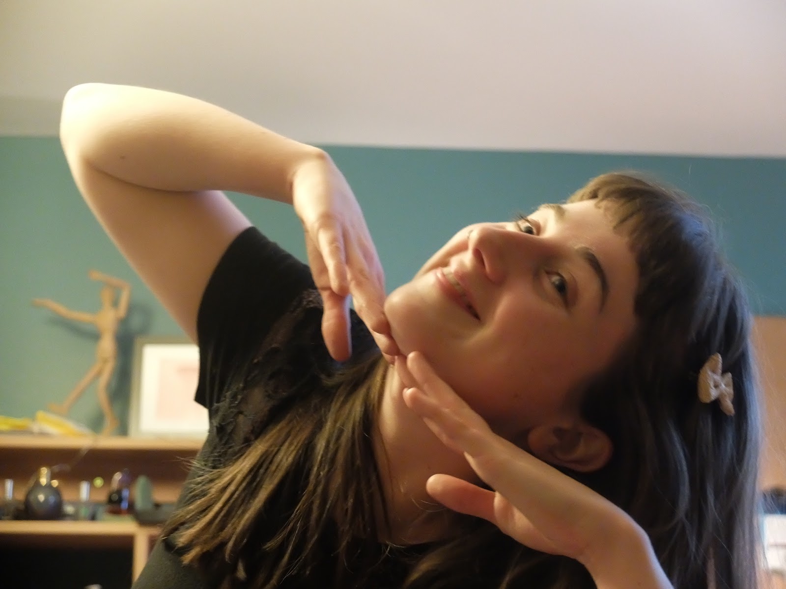
I got loads of photos of my flatmate dancing in her room to the song which were really excellent. I got her to dress up in girly childlike clothes with little bows in her hair.
I got loads of photos which I wanted to draw a large amount of but I was running out of time so I had to just chose a few. I managed to draw enough for 12 frames.
I have enjoyed this project and this is now one of my favourite songs. I always work with music blaring out of my speakers so that I have positive energy that I can transfer into my work and this has been really important.


I also took some head shots of her but decided that I wanted to use her whole body dancing.

I used swatches for these images. Again I have used 3 different tones to try and keep it simple. I also used different thicknesses of line for the outlines to the face and the hair. The hair is the most detailed part of the character built up with lots of lines which contrasts well with the clock colour everywhere else. I create a different layer for each different colour with the outline in mid orange in the for-ground. I tried to keep the drawings loose not worrying about the exact number of fingers or the shape of her feet too much.


When creating the Gif I aligned everything up through the use of opacity and aligned the feet so that it makes sense her dancing. Some of the figures are larger than the others because he weight is more forward so that doesnt matter. I also think different heights add to the movement. When I was in photoshop I used shift most of the time to make the figures larger or smaller but a few of the images looked better stretched so that they looked more similar to the others. Also some of the images werent central so I had to free transform and move the image so that it worked with the other images.

I made a little practice one (which has kept a few slides of my reference alignment in). Through making this I realised that I needed to start over with the images because I hadnt deleted the backgrounds so I couldnt add a different background in. So I went back and had to rub out the for-ground layer so that it became see-though.

I took inspiration for the background from my flatmates skirt. I thought flowers would look quite quaint and reflect the characters personality. I also wanted it to work well as a pair with the guy dancing and use similar sized shapes.


This was my Gif! I thought I would have a go with experimenting with the opacity of the background so that the attention of the character wasnt lost with what is going on in the background. The guy Gif was slightly different because it was softer due to the materials used but this is very bold and opaque.

This Gif is 80% Opacity of the background

This Gif is 65% background Opacity. I chose this one as the one to submit!
Again if you focus on different parts of the body it is quite fluid. I think the few lines that are on some of the images of the skirt really add a swish to it and I like that the hair flows around on her shoulders and her arms have a little push down.

I am also quite impressed with my self because I managed to turn the Gif into a video so I could upload it to facebook. Rather than saving it to web (legacy) you have to export, render video. For facebook it has to last a minimum of 10 seconds so this meant copying and pasting the slides quite a few times.