DESIGN PROCESS
We decided that we were going to take a typography style map of where we went, mapping all of the red things that we saw...
From this we decided to redraw some of our images limiting them to block red and drawn black lines.
We were going to draw these and then pick our favourite 2 each to add together into the typography poster.
This is the first layout we decided on however we found it difficult to visualise everything (sizes, colours, shapes).
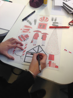
Then we had the idea of re-sketching/photocopying our drawings in the correct colours and decent sizes, cutting them out and collaging them into place. This is the final outcome that we had.
From this we traced onto magic tracing paper...colouring with a magic pen for the blocks of red.
From this we decided that to make things less like an image we could create as a drawing we decided to use shapes to make the colour. This hopefully will work in our favour for things not lining up properly but will also make it more striking, having things not totally lines up-more abstract.


No comments:
Post a Comment