Saturday, 12 November 2016

Book Cover Final

Final Book Cover


I started by creating type as the backgrounds to build up texture. This was building on the rough very similar to this.

I then tested my only photoshop skill as of then, how to "invert" so after scanning I inverted the flaps to be the other way around. This gives a very flat effect because it is done on photoshop however it looks very smart. I like that the flaps are the same idea as the main background but contrast due to the inverse of the black and white.

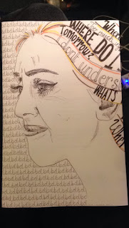
This is the image I created for the front cover. I changed some of the words in her hair to be more focussed on dyslexic thoughts than things which could be wider as anxiety. I also used coloured pencil rather than chalk pencil so that I was bolder and less smudgy. I drew her face with the outline being a confident line. This has changed the overall aesthetic of the piece but adds more contrast of line to the features and fits with the confident lines in the hair.
I then scanned the image in and cut the image in half so that it could fit the spine in. I then used a magic wand too to select only the image and delete the background so that I could add it into the handwriting on the back.

At this point I came across a problem... Although I had thought it would be simple to flip the image, I hadn't taken into account that I had words which would be shown backwards. I had to take a breather and try not to have a major panic. I decided that it was most important to have the words facing the right way so I rolled with the face being on the back and the hair being on the front-at least it will draw attention to the back cover too. It also left more space for the font to go on the front cover. I can't believe that I didn't learn from my mistakes before... I did bear it in mind and at least knew which side the writing was going on! I guess maybe I can get away with it because it is a book on dyslexia and my dyslexic brain couldn't get my head around the layout!?!?!

I dimmed the transparency of the handwriting behind the face so that it wasn't so harsh and was just a background. I like that mainly this book cover works on black and white- the colours of text and handwriting, playing around with light and dark by alternating the black and white backgrounds. I also like that there is some application of colour but only in small lines just to add some life to the cover.
However adding this to the blog I have just noticed that the lines of the hair don't write match up... but I don't feel this ruins the overall aesthetic.
I also had the problem that I it was too large for a printer so I started off making it in 2 halves and then decided to print as much of as in this image in one go and then print of an extra part for the other flap and stick them together. I had heard from others that glue made the paper crinkly so I have used double sided sticky tape. I think that doing it on the flap is best because if the spine raps around it will look a lot neater and more professional.


No comments:

Post a Comment