Monday, 28 November 2016

Hot Dog Book

Hot Dog Book Activity
My 3 words to chose between:
Ritual
Health
Trees

I firstly didn't really understand the term ritual and therefore felt that I couldn't explore this theme to its full.
Secondly I am having health problems at the moment and although this would mean I would be able to draw whilst spending time in the doctors/hospital however I don't want to spend more time thinking about health than is necessary.
Lastly I like trees and woodland especially at this time of the year and so I chose TREEEEEES!

I had some discussions with various people about if they liked trees, why they liked trees, if they had favourite trees, if they had any stories about trees...

1) Likes thick forests (when you can't see the edge of the forrest and can get lost in the trees)
Unfortunately she said that it was quite space where she grew up (more hills, mountains and beaches)

2) Likes drawing trees
Likes dead trees particularly, hanging trees (willows/vines/overgrown/moss)
Says green in a really nice colour
Most natural big things-extremely wide and old "natural giant structures"
Thinks tree houses are cool
Loves the trapped light from forests-especially the autumn
Lives in a horse shoe shaped street. He used to climb trees that branched over a stream. One time one fell over. He sat on it and someone pushed him off and he fell into nettles. It sucked.

3) Loves trees (nature) - a tree hugger
Has grown up around trees
Favourite trees are the ones with red leaves and holly trees
Autumn is her favourite time (not too hot or too cold and beeaaautiful-colours)
When she was about 15 she was supposed to go on a date  but got stuck up a tree for aaaaages...her friend had to phone her date and tell him that she couldn't make it because she was stuck up a tree! This is what happened...


He used to build tree houses with his father. His father used to cary large trees and he used to struggle with only small branches. He said it was really crazy to think how when they went back to the same spot it had changed. Anything could have happened inside the shelter (a romantic night, a homeless persons home) and animals could have been around/inside it.
From this I think my project could lead to the specific themes of: 

  • Investigating different types of trees
  • Different dependent wildlife
  • National Parks
  • Bark
  • Leaves
  • People walking
  • Favourite trees
  • Christmas trees (festive)
  • Buildings/deforrestationg (opposite of)

I could ask people the questions of:
Do you have any stories about trees?
What do you feel whilst under this tree?
What are you thinking about/is going through your head?
Why are you here?

Tuesday, 22 November 2016

Design Plan for Map!

 DESIGN PROCESS
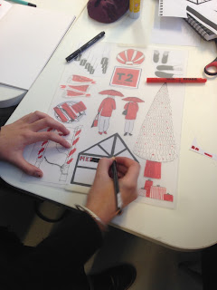
We decided that we were going to take a typography style map of where we went, mapping all of the red things that we saw...
From this we decided to redraw some of our images limiting them to block red and drawn black lines.
We were going to draw these and then pick our favourite 2 each to add together into the typography poster.
This is the first layout we decided on however we found it difficult to visualise everything (sizes, colours, shapes).
Then we had the idea of re-sketching/photocopying our drawings in the correct colours and decent sizes, cutting them out and collaging them into place. This is the final outcome that we had.
 From this we traced onto magic tracing paper...colouring with  a magic pen for the blocks of red.
From this we decided that to make things less like an image we could create as a drawing we decided to use shapes to make the colour. This hopefully will work in our favour for things not lining up properly but will also make it more striking, having things not totally lines up-more abstract.

Journey round Leeds

Leeds Trip
It was a horrible rainy day...
And we walked around Leeds for 4.2 hours...
In the freezing cold wet...
We started off just walking in the direction we knew...towards town.
We took photographs of things that seemed interesting...

 Here we began to notice  the theme of RED was occurring frequently... then we started to embrace it.
Headless fish!
 Ran after these ladies trying to get a photo


Saturday, 12 November 2016

Book Cover Final

Final Book Cover


I started by creating type as the backgrounds to build up texture. This was building on the rough very similar to this.

I then tested my only photoshop skill as of then, how to "invert" so after scanning I inverted the flaps to be the other way around. This gives a very flat effect because it is done on photoshop however it looks very smart. I like that the flaps are the same idea as the main background but contrast due to the inverse of the black and white.

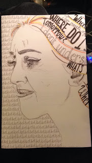
This is the image I created for the front cover. I changed some of the words in her hair to be more focussed on dyslexic thoughts than things which could be wider as anxiety. I also used coloured pencil rather than chalk pencil so that I was bolder and less smudgy. I drew her face with the outline being a confident line. This has changed the overall aesthetic of the piece but adds more contrast of line to the features and fits with the confident lines in the hair.
I then scanned the image in and cut the image in half so that it could fit the spine in. I then used a magic wand too to select only the image and delete the background so that I could add it into the handwriting on the back.

At this point I came across a problem... Although I had thought it would be simple to flip the image, I hadn't taken into account that I had words which would be shown backwards. I had to take a breather and try not to have a major panic. I decided that it was most important to have the words facing the right way so I rolled with the face being on the back and the hair being on the front-at least it will draw attention to the back cover too. It also left more space for the font to go on the front cover. I can't believe that I didn't learn from my mistakes before... I did bear it in mind and at least knew which side the writing was going on! I guess maybe I can get away with it because it is a book on dyslexia and my dyslexic brain couldn't get my head around the layout!?!?!

I dimmed the transparency of the handwriting behind the face so that it wasn't so harsh and was just a background. I like that mainly this book cover works on black and white- the colours of text and handwriting, playing around with light and dark by alternating the black and white backgrounds. I also like that there is some application of colour but only in small lines just to add some life to the cover.
However adding this to the blog I have just noticed that the lines of the hair don't write match up... but I don't feel this ruins the overall aesthetic.
I also had the problem that I it was too large for a printer so I started off making it in 2 halves and then decided to print as much of as in this image in one go and then print of an extra part for the other flap and stick them together. I had heard from others that glue made the paper crinkly so I have used double sided sticky tape. I think that doing it on the flap is best because if the spine raps around it will look a lot neater and more professional.