Tuesday, 29 January 2019

Application of Rhythm Paintings

Application of Rhythm Paintings

I think that these would look really striking as an edition, a collectors item applied to different merchandise. They are a way of commercialising the work from this passion project. They look very smart as they are black and white.

Do I need to apply my imagery? Should they be stand a lone images and shouldn't be applied to things like merch? Does this detract the aura and honesty of the images?


Sunday, 20 January 2019

Photoshop rhythm paintings

Adding colour through photoshop

I do like this and value colour in application of these paintings. I am not sure that digital colour is the right way to add colour though. 
I think it detracts from the expressive line quality and takes something created analogue and in the moment and turns it into a processed, edited image. They are manipulated afterwards when not in the musical bubble.


The Doors - Break on through
I think this edit is quite successful. I think that this deep blue is the right colour for the doors music. I like the invert as well, I think it captures the reflective spatial nature of their music.

Fanny - You're the one
I think the purple is right for this band, it is warm, powerful and funky. I think that here maybe the colour is too bright and it is quite distracting from the marks.

Hot Wax - King Gizzard and the Lizard Wizard
I like the garish bright colours, I think they are reflective of the music. The clashing contrast between the green and orange is quite psychedelic

Hot Wax - King Gizzard and the Lizard Wizard
I like green being the darker colour. I think the orange background reflects the atmosphere and energy of the music but the dark green visualises the heavy, repetitive driving rhythms.

Elastica - 2:1
I like the deep maroon as the background, I think it is the right colour to portray the essence of their music. I also like how some of the lines are silver and almost metallic and I think this reflects the guitar sounds. However I think it is too busy and the lines look better solid

Elastica - All Nighter
I think this image looks very punk but not reflective of Elastica necessarily. The solid red takes away the textures and line quality of the expressions, it looks messy.

Elastica - All Nighter
I like this. I think it has a nice balance of solid background, grey textures but clarity of depths. However I think this would look better flatter, maybe less digital and bright.

Green River - This Town
I like that this is very cold. It makes the lines seem harsher. I think the whiteness of some of the lines aren't very representative. It is very much thick and heavy music so grainy light marks aren't appropriate.

Unwind - Green River
I think this image is just too dark. You can't see clearly enough what is going on.

Jefferson Airplane - White Rabbit
This is an interesting image. It portrays the lights (the emptinesses and space) and darks (development and melodies) of the song. There is a lot going on in this image though.


Saturday, 19 January 2019

2nd 7x7'


2nd Reflective Post

Evaluation – Experience and Expression

I have once again realised the importance of process in my practice. It is the experimentation and energy that are the interesting aspects of my work rather than solid final outcomes and something I should embrace.
With this project I think it is the journey and combination of works which is powerful rather than final products. It is the personal musical experience which matters to me and it is the experience of making different outcomes which begin to capture the aura of music, visually.

My initial visual creations were collage. They were created in my personal bubble and are a method of image making I am very comfortable with. I often use collage as an alternative to creating sketchbook roughs. They acts as a mood board for colour. They are rough, tactile and a balance between considered and intuitive. They proved their purpose here and broke down the barrier between words and visuals, getting me to listen and consider the different elements of songs. I started to visualize how I can communicate the patterns of sound through different materials, sizes and shapes, however there was a large number of mixed media used which is way too complicated.

Inspired by research in performance responses to music, I began responded to music through tap dancing. It is a natural way that I express myself and a way of exerting my rhythmic responses to songs. I chose songs from my top 10 list and improvised, spontaneously letting my feet guide the responses. I videoed these, allowing the viewer to see into my intimate and personal musical experience. I also noted that this footage could become useful for applying to other media.

I then took the tap dancing further and combined image making with movement and danced in paint. This created a “map” of my musical experience as a painted/completed product. Filming captured the movement of the experience. My feet had created their own visual language through the duration of the piece. They are visually interesting paintings however the use of colour wasn’t well considered due to limited resources and the speed of choosing the colour in the moment. I think they could have been bigger and this would have made the images less dense and the footprints could have more purpose.


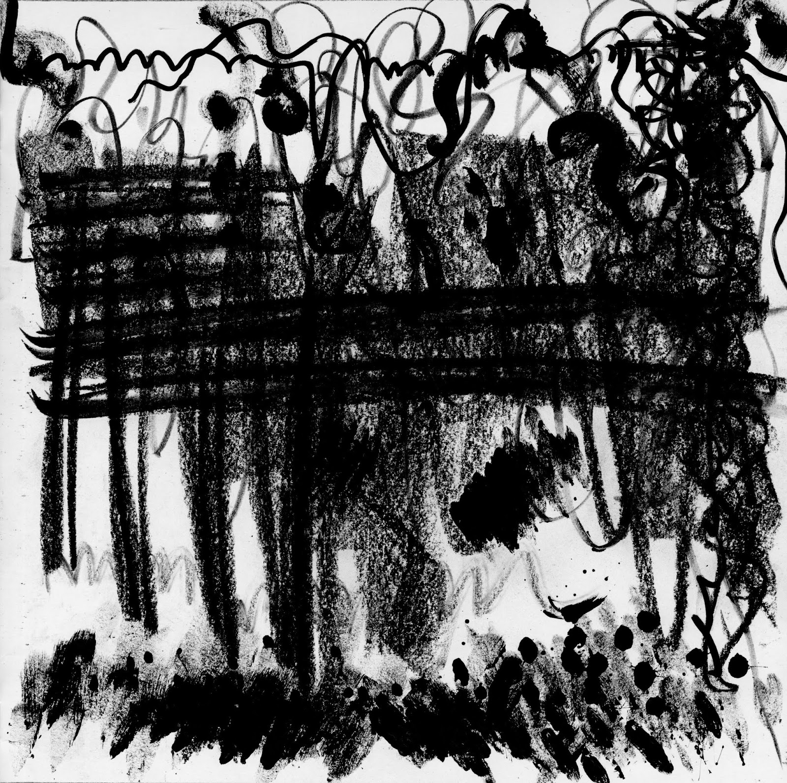
I then explored how I could capture the rhythm of the songs through creating my own musical visual language, experimental music notation. I wanted to take the colour out of the imagery and solely focus on capturing the different sound elements of the songs. This was through drumming with paint brushes and expressing the shapes which were appropriate to each instrument. These were deep, raw and honest expressions of music. They were not considered, purely felt and created in that musical moment
These paintings are essentially the ammunition for the rest of my project, they have got the ball rolling!

Ideas for outcomes

- Take my rhythm visualisations and add duration to them, put them in time. Create a long progression which can be turned into something like a publication but captures the travel and change over the song, rather than a static snapshot which has its own importance but doesn't portray the embodied journey effectively.

- Colour is important to musical experiences. How can I add colour? Through print? Screen print with multiple colours? Riso is an immediate form of print...?

- Add substance to my exploration by reading around the subject of visualising music, Not necessarily music art books but the theories of musical psychology and visualising the senses

- Find merchandise and ways that I could apply my visualisations to within the music industry. Who is my audience? Music enthusiasts, music industry, bands, fans.

- Slow shutter speed (motion camera shots). Could take these at gigs and live musical performances of the bands. Could take them of me tap dancing in response to my bands, capturing the whole movement. Could then develop these and overlay them with artwork. Could drum and rhythm paint directly onto them, capturing a multi-dimensional expression.

Friday, 18 January 2019

My Rhythm Painting

My Rhythm Painting

These images are raw and honest experimentation. I really like the expressive qualities of the images. I think that they capture the essence of each song in a very energetic and interesting way
I think that mood and tone does still need to be considered as I associate colour so strongly with listening to music. 
For me listening to music is a multi-sensory colourful and vibrant experience.


2.1 - Elastica

Line Up - Elastica


You're the one - Fanny

Close to me - The Cure

Lovecats - The Cure

This Town - Green River


5 to 1 - The Doors


Good Vibrations - The Beach Boys


Surfin USA - The Beach Boys

Everybody's happy now - Buzzcocks
Touch it? - Buzzcocks

Mass Extinction - Mudhoney

Touch Me Im Sick - Mudhoney

Rattlesnake - King Gizzard and the Lizard Wizard

Somebody to love - Jefferson Airplane

Monday, 14 January 2019

Experimental Notation Research

Experimental Music Notation

This project is turning into creating a visual language to express music
Arguably there aren't words to describe music, music is 'the language of emotions' (Kania 2017). 

My art is therefore trying to create its own vocabulary to communicate my subjective responses to music.

COLOUR
SHAPE
ABSTRACT
LINE QUALITY
ON THE MUSIC SCORE TO TRACK TIME
COMPLETE SCRAMBLE OF THE SOUND

This seems like a visualisation in order to explain what is in the artists head. Everything is spread out like a spider diagram of different points and pieces of information.

John Cage
This has the thickness and main body of the sound through the middle (perhaps even the rhythm as it is very regimented) as a grid and then the other melodies escaping loosely.
John Cage
Where the music is present, sound mapping the location and direction of the music minimally through linear form. 


A score of music communicating the change in sound logically through colour and size and position of the circles. Definitely has its own musical language here.
Each different instrument and different part has its own line. Can see the where the music thickens and builds up but not particularly how to play it. Can see traditional musical notational elements here. Perhaps this would be useful for a conductor?
This seems like a subjective expression of the music rather than something that someone else could understand. It communicates the feelings of the different elements of the music.
Paul Chan

This communicates the musics presence in time. Along a traditional score it maps out the shape of each note, how each note should be played. Perhaps this would accompany a traditional music score as instructions on how to express the notes?
Wadada- Leo- Smith
This seems to visualise the musical space. It is very atmospheric and expresses how the artist felt when experiencing the music.

Friday, 11 January 2019

Glass visualisations

Glass visualisations

I have wanted to create glass art through this whole degree and finally this was the time! 


I very much associate music with bright colour and light and these are qualities that glass certainly has. It also, when low tac fired, has texture and therefore is tactile meaning that this music (my interpretation of) becomes touchable.

Taking inspiration from my music visualisation collages, I took elements and simplified them into thumbnails for glass art.


I found that even though I had simplified my collages into lines to work when much smaller, glass couldn't create a curved line. Therefore I had to make alterations and use the thumbnails for inspiration rather than to exactly copy.


(Right to Left)
1.Beach boys
2.King Gizzard and the Lizard Wizard
3.The Doors
4.The Cure
1.Green River
2.Elastica


Once the glass had been fired, they look quite different. Some of the colours totally shrivelled up and have disappeared (eg. purple and pale blue). 
They turned from dense images to ones with lots of clear glass. 
I think also that the more simple designs are the better ones (eg. the beach boys)

These images are scans and they look quite blurred. They capture the light through the background but due to the thickness of the glass, the clarity of the textures isn't good.

Unfortunately I can't really create these again because I have totally used up these coloured stringers (sticks).


King Gizzard and the Lizard Wizard

Beach Boys

The Doors

The Cure
Elastica

Green River